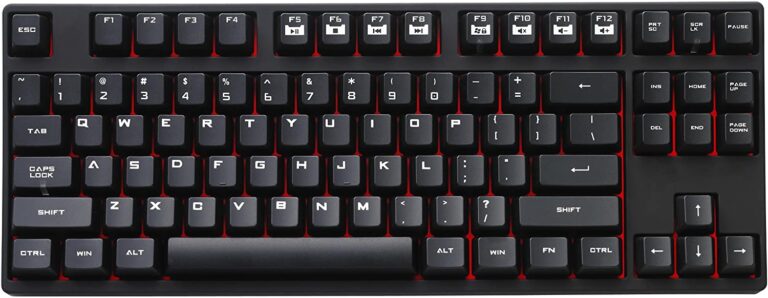
Best Color Schemes of The Mechanical Keycaps – Updated 2022
Since each keycap is created with a background and theme by one or more designers who will incorporate their ideas into this set of keycaps, there will be many classic colour schemes. Many people wonder why a small keycap is so expensive, but I believe it is the creativity and innovation that make it valuable.
The colour of keycaps always appears to be overlooked, even though customers often only purchase one colour for standard keycaps. Although many people would want to discuss material, height, feel, and craftsmanship. Is it feasible to use your ingenuity to match those classic colours or DIY keycaps? The obvious response is that numerous businesses sell coloured keycaps for creativity, and there are also keycaps that can be dyed, so there won’t be a shortage of colour options.
Let me share 20 keycap colour schemes with you, some of which are classic colours that have been used previously and others which I created. The aforementioned colours are 87-key keyboard collocations; thus, they should only be used as a guide because each person has different demands.
1. Black and White gradient
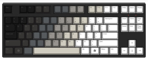
Through the use of a gradient of colours, several layers are revealed, progressing from black to white and from dark to light. It is quite tough to achieve the appropriate choice of keycap colour, but it will be simpler if you use the dyeing process. The colour schemes of this set of keycaps fit the personality, and a natural transition will be extremely attractive to the eye.
2. Pink Electrocardiogram
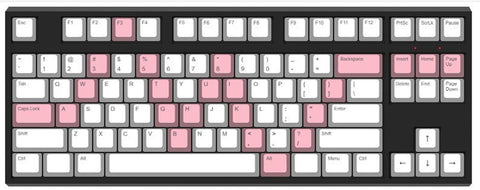
The colour scheme has a primary colour, which is white, and a secondary colour, which is pink. White conveys cleanliness, and pink conveys a sense of nature; also, the pink keycaps make an electrocardiogram wave in the letter area, which represents the heartbeat. The colour patterns of the keycaps are going to be a hit with the vast majority of female gamers. The colour scheme will be relatively straightforward, with just two colours that are most frequently used.
3. Purple (Black Widow)

The lettering in purple are meant to depict the Black Widow’s skin, the wisteria in the functional area is meant to reflect the tights that she wears, and the crimson ESC is meant to represent the trigger of its weapon. It is tough to find two different shades of purple that contrast one another, but this colour scheme is the official colour of ZFrontier, and it works well with the Black Widow Concept. I really like it.
4. EVANGELION-01-inspired Keycaps
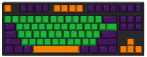
This colour is designed and produced by SP Company, and later on, the domestic brands also launched the EVA luminous keycaps; and as of right now, the 2 sets of keycaps have not been for sale again, so you can imagine how classic it is! It is a model that comes in three colours: orange, apple green, and purple. You can imagine how classic it is! These three colours aren’t hard to come by, and you can make your own makeup using them!
5. Carbon Color Scheme
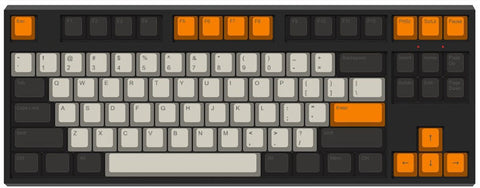
Another classic Carbon model, this one comes in ivory, black, and orange and has tri-color keycaps created by T0mb3ry. The SA profile height sets it apart from the competition. In my opinion, its popularity has surpassed that of the granite model, to the point where later GMC and the regional brand Wuming Eslite produced their very own huge “Carbon,” and now the enormous carbon colour scheme that is used by domestic manufacturers is blossoming everywhere.
It is important to notice that the colour of its letter area is not pure white, something that many domestic producers have disregarded despite the fact that it should be highlighted.
6. Cheese Green
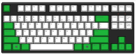
The letter area is white (White), while the functional section is grass green; combined with a white casing for the keyboard, it gives the impression of being both refined and obscene. I believe that it is the best colour scheme in Filco limited edition keyboard with the right modification. It is not too difficult to choose a colour scheme, but the green grass needs to be considered twice. Of course, this colour scheme is well-known, and it is Fico’s most classic cheese green.
7. Gray and White
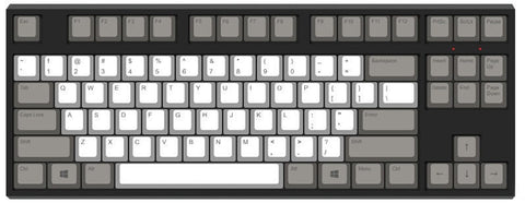
Even though the white of the letter area and the steel grey of the functional area do not draw attention to themselves, if the ESC is red, it is the classic colour of Wang Ziru. Although I am unable to verify the reason why this colour scheme might be related to Wang Ziru, it does create a feeling of melancholy when taken in conjunction with the rest of the colour scheme.
8. 1976
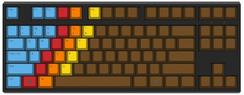
1976 is the name of this colour scheme that was conceived and manufactured by SP Company. The colour blocks in this scheme make use of an uncommon diagonal direction with a strong tone. The mixture of Cerulean blue, Permanent red, Lemon yellow, and Burnt umber is complex without being muddled in any way. In terms of colour scheme for DIY projects, the only colour that is uncommon is brown; the other colours are rather prevalent.
9. DND
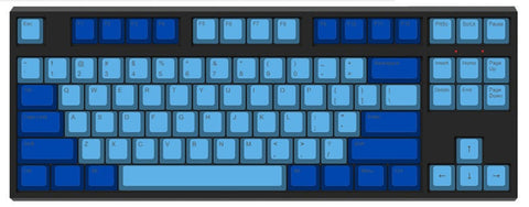
Dasher & Dancer is the name of DND, and it is a classic colour scheme that was created by the SP firm. The classic Dasher terminal served as an inspiration for this design. The region that contains the letters is cyan blue, the area that has the functionality is cobalt blue, and the colour gradient transition gives people a sensation that is profound and hushed. Of course, the colour scheme may also be flipped. There are two distinct hues of blue that are not hard to locate.
10.Darkness
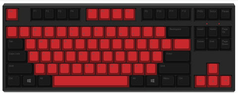
The region that contains the letters is coloured Permanent red, while the section that contains the functions is coloured black. The colours of these two parts provide a dramatic contrast that has a powerful impact visually. The colour scheme of this particular set of keycaps was developed by domestic Pofocaps. Because it is a set of keycaps with a DOTA2 backdrop, its value is significantly increased. Both red and black are typical colour colours.
11. Purple and Pink
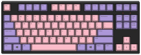
The combination of rose pink in the letter area and purple in the ribbon makes you feel warm and has a flavour similar to that of an iris offered by GMC; nevertheless, I believe that pink is more in accordance with purple than it is with blue. Both colours may be discovered with relative ease.
12. Akko Wave Keycaps
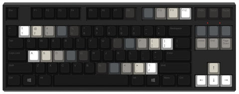
It is yet another black and white keycap, but this one has a more pronounced gradient packed into a smaller space, thus it appeals to a greater number of individuals. The complexity of the self-color scheme has been somewhat lowered as a result of the reduction in the number of changing keycaps.
13. Red and Pink
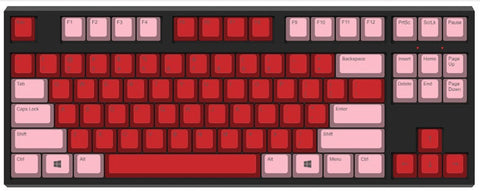
Scarlet letter area + Pink is used for the functional area, and the combination of red and pink makes the keyboards look like a rose in bloom. The colours are popular, and the combination of red and pink makes the keyboards feel hot and uncontrolled.
14. Black and Pink
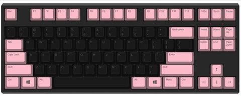
Two opposing colours, black for the text area and pink (Pink) for the functional region, create a gloomy atmosphere; personally, it makes me think of something a little bit sinister.
15. Dolch
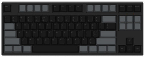
Another timelessly classic hue is the Dolch vintage colour. The classic combination of black in the letter area and sky grey in the functional area, also known as regional inverse colour, raises the question: where did this combination first appear? For the purpose of commemorating the Dolch Pac terminal, two colours are utilised. In the 1990s, Dolch built a series of specialised portable computers. The colour of the keyboard is black and grey, and in order to memorialise the classics, SP manufactured Dolch colour keycaps.
16.Blue and Green
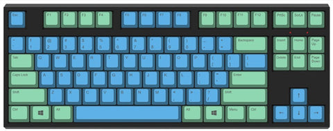
The sky blue of the letter area is paired with the ice green of the top functional area, creating a mood that is clean and natural, similar to how the smoke and rain lanes of GMG appear to be.
17. Black and Purple
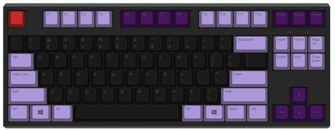
The colour scheme of black and wisteria should also be considered a classic combination. Since purple is a blend of red and blue, it is a good attractive colour to use with black since it gives people the sensation of being noble and mysterious.
18. Miami
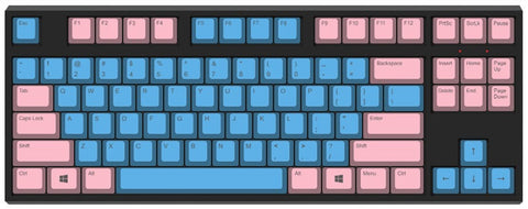
The city of Miami has a colour scheme that consists of cyan blue (Cyan blue) in the letter area and pink in the functional area. These colours are meant to reflect the blue sky, white clouds, and beach in Miami. This colour scheme was developed by the SP firm. Even though blue is a hue that fades, it has the potential to be quite striking when its level of brightness is increased. Blue serves as the point of departure if a warm colour is the primary colour.
19. Blue and Green
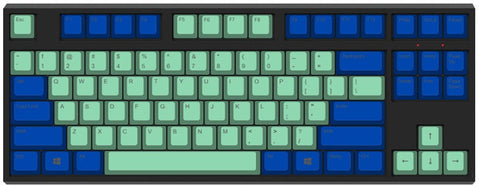
Indigo in the functional area is matched with cerulean blue in the letter area. The blue is the transition colour, with azure representing the calm sea and indigo being the deep sea. From shallow to deep, from near to far, the colour scheme presents the vastness, silence, remoteness, and breadth of the sea.
20. Campfire
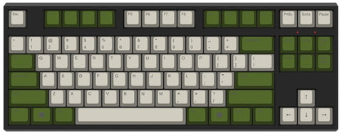
The flax colour of the alphabet area (Ecru) and the olive green of the functional area highlight the feeling of camouflage uniform, and the keycap is a theme set designed by Ma Lu, which uses a colour system that better reflects the military career, the theme is clear just like the military top. The theme uses a colour system that better reflects the military career. These two colours are harder to get than the others.
Summary
There are still a few things that need your careful consideration: When searching for keycaps, it is important to pay attention to the height of the keycaps because there is still a significant difference in the height between the various specifications of keycaps. In the event that the keycaps do not match, it is important to ask whether the keycaps are OEM, DSA, or original factory.
The same set of keycaps also has a varying height of their keycaps; to avoid the problem of inconsistent curvature, you should inquire as to whether or not it is compatible with R4, R3, R2, or R1. If you want to DIY, don’t worry about the scheme needing too real of a colour fine classification, the general direction of the right won’t be a problem, of course, this also depends on your own individual requirements and ideas.
The colour that is marked up above is for the purpose of better displaying its initial appearance. There are several manufacturers online that can assist you, and you can buy the final product straight from them. Some classic colour schemes for keycaps include colours that have been given unique names.

